
Skinly Case Study
In this project for the UX Design course by Google, I created an website for a skincare brand
Challenge: The target customers of Skinly suffer from skin conditions such as acne or dry and sensitive skin, they
want to be able to buy products to help address those concerns.
Solution: My goal was to design an website where customers can easily find products for their specific skin concerns
as well as find relevant information from users and specialists that can further help them with their skin problems.
Research
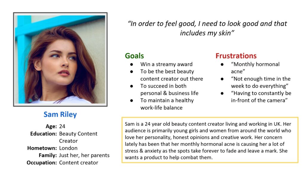
Persona 1.
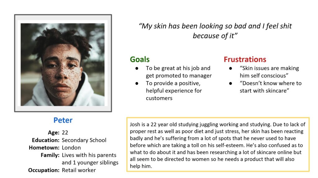
Persona 2.
Research Overiew
I conducted user research and received feedback from users that I turned into user personas. One of our user personas, Sam Riley, is a 24-year old beauty content creator in London. She reviews makeup and skincare products as well as educates and informs young girls and women around the world. Research revealed that Sam Riley was stressed and anxious due to her monthly hormonal acne as they take forever to fade and leave a mark. She wants to try out new skincare products that help with re-occurring and persistent acne.
Important Pain Points Discovered from Research
Users want to be educated and informed about skincare products, how and why to use them, especially those trying it out for the first time
- Users want products that will help them solve their specific skincare concerns such as dry skin, acne, sensitive skin and more.
Ideation
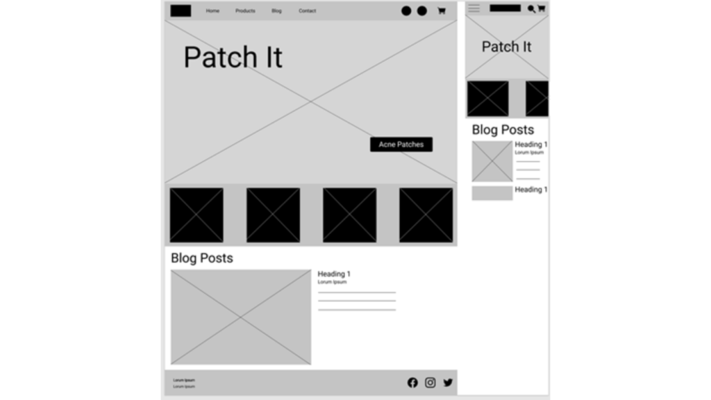
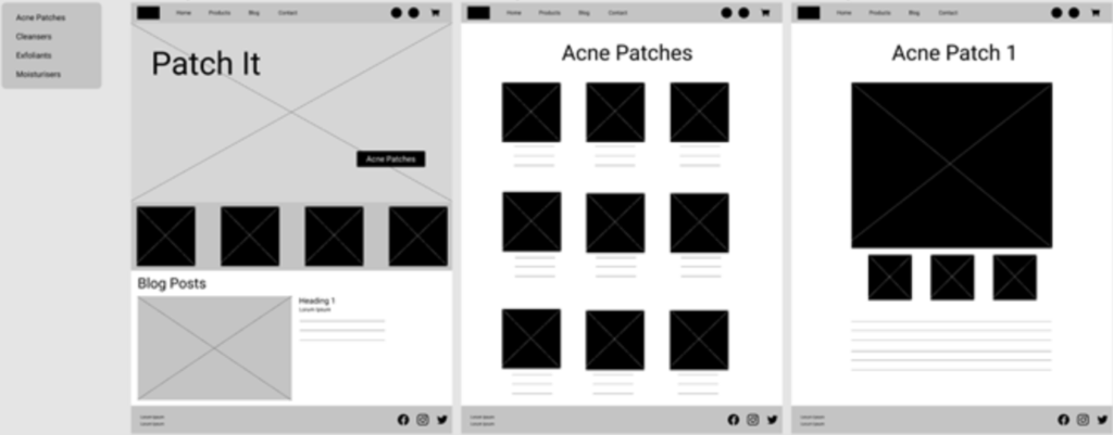
Lo-fi designs
Usability Study
Study type: Unmoderated usability study
Location: London, UK, remote (each participant went through the usability study in their own home)
Participants: Six participants, each completing the study individually. 3 males, 2 females, 1 non-binary individual & the age-range was between 16-35.
Length: Each session was 5-10 minutes, based on a list of prompts
Results: Considering all the information of the participants, design additions included more pages to showcase how the pages would interact with each other, what the products page could potentially look like as well as a sub-menu bar for the products.
Revised designs after usability study
Mock-ups
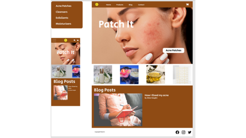
Now the design really begins to take shape: actual text is used, colors are applied, and images are added. This mockup shows a visual that gives a better idea of the final design.
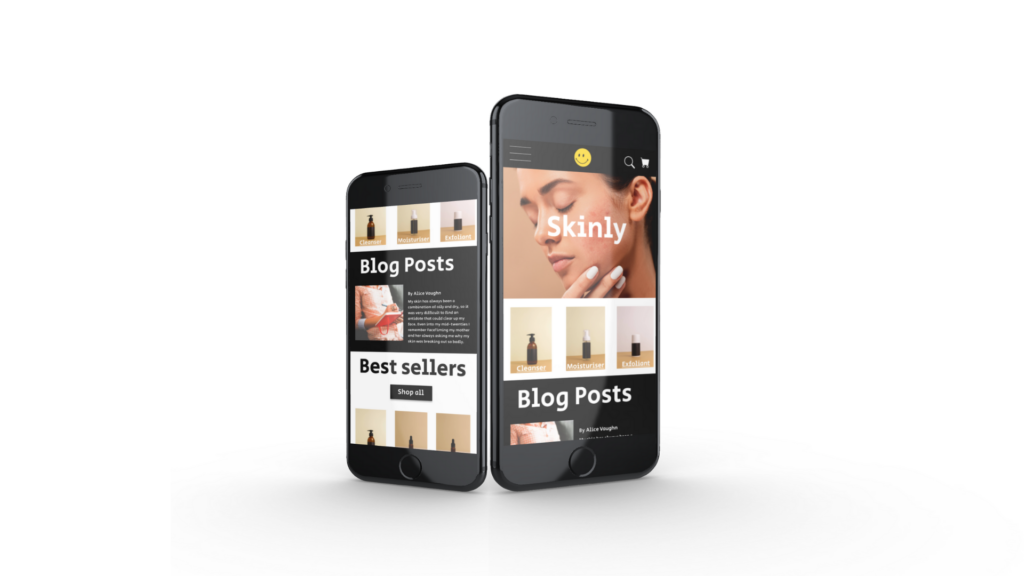
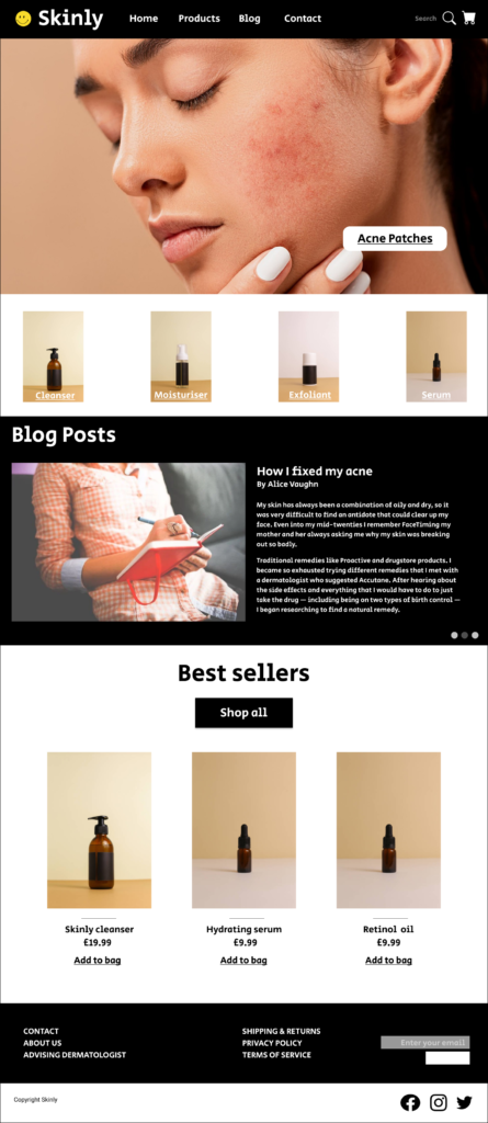
The final polished design
Final version of the homepage as well as the app version of the homepage.
The name of the company was changed to better suit the aesthetic and feel of the company.
Accessibility considerations
For the website and app, the images on each page use alt-text to allow a screen reader to read the content.
The colour contrast also takes into account people who might have visibility issues.
Further usability studies would be beneficial to highlight any other accessibility considerations.
What I learned
While designing the Skinly website and app, I learned a lot about website design and all the thought-process that goes into it to ensure that it solves users problems as well as makes the experience something they enjoy. The process is a bit different when creating an app so I was grateful to learn new skills and new insight into UX and UI.
As time goes on and users continue to give feedback as well as you look at the website design more, future improvements will surface and become clearer, and the product will continue to get better.
Moving forward, I would like to conduct another round of usability testing to validate whether the pain points my users experienced have been fully resolved. This would validate that all the updates as well as introduce me to any new pain points that might have occurred.