Revitalizing a legacy product: Enhancing accessibility and user experience through end-to-end redesign.
Sector: Pharmaceuticals, healthcare, aviation, and finance.
My role: Lead designer and researcher
Challenge: The outdated user interface was cumbersome and unintuitive, leading to frustration and decreased productivity among all users. Additionally, the legacy product had numerous accessibility issues, including non-compliant colour contrasts, lack of screen reader support, and poor keyboard navigation, making it difficult for users with disabilities to effectively interact with the product.
Solution: To address these challenges, we conducted a comprehensive accessibility audit and user research to identify specific pain points. Based on these findings, I redesigned the interface with a modern, clean look that adheres to accessibility standards such as WCAG 2.1. Usability testing with diverse user groups helped me iterate and refine the design. The result was a significantly more accessible and user-friendly product that enhanced the experience for all users, particularly those with disabilities.
Business value: By enhancing accessibility and user experience through end-to-end redesign, we shortened the creation of review process by over 25%, reduced confusion and support tickets for errors which increased user satisfaction and task completion.
Heuristic analysis
First stage of the project was to conduct a heuristic analysis of the product. A deep analysis on what is and isn’t working within the project, what pain points can I see – this provides me with important information that I can bring to the stakeholders meeting (examples below).
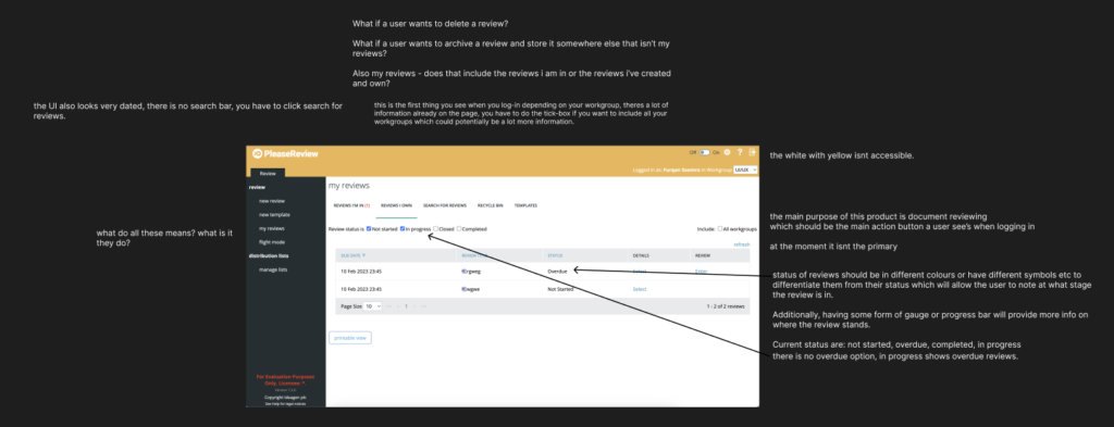

Project meeting
Had a 2 hour meeting with stakeholders including project manager and developers to showcase my findings from the heuristic analysis. I also got to understand the scope of the project, the timeframe for deliverables as well as who will I be collaboratively working with from the development team.
Initial user research
With the help of the head of research, we conducted interviews with users, their roles were system administrators, medical writers, regulatory writers and energy agencies. We interviewed to better understand any pain points and how they use the product in their jobs.
Goals:
Which features of the product are utilised in their workflow? Which features aren’t and why?
How does the product contribute to their job objectives?
After completing the user interviews, we got valuable feedback that really helped push the project forward.
Findings from interview
Insight 1: users expressed challenges in the utilisation of some features, emphasizing the need for enhanced training and information about how to use them.
Insight 2: users mentioned performance issues revolving around upload speed, system responsiveness, error resolution through support.
Insight 3: users emphasized the need for flexibility and customization to accommodate diverse review workflows and document types
Insight 4: clearer communication, both in interface design and training materials has emerged as a crucial element in fostering a more seamless and efficient review process.
Ideation
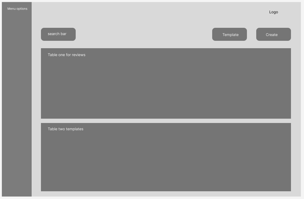
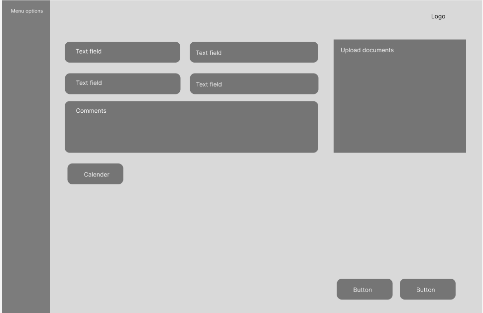
Wireframing, proto-typing and usability testing
This project provided an opportunity to explore creative and open-minded approaches to renovating and enhancing the UI. I was mindful of the needs of legacy users, who are accustomed to a specific flow and user journey. Rather than completely reinventing or disrupting their experience, I prioritized evolving and refining the UI and structure to build on the familiar flow while introducing meaningful upgrades.
Hi-Fi Designs
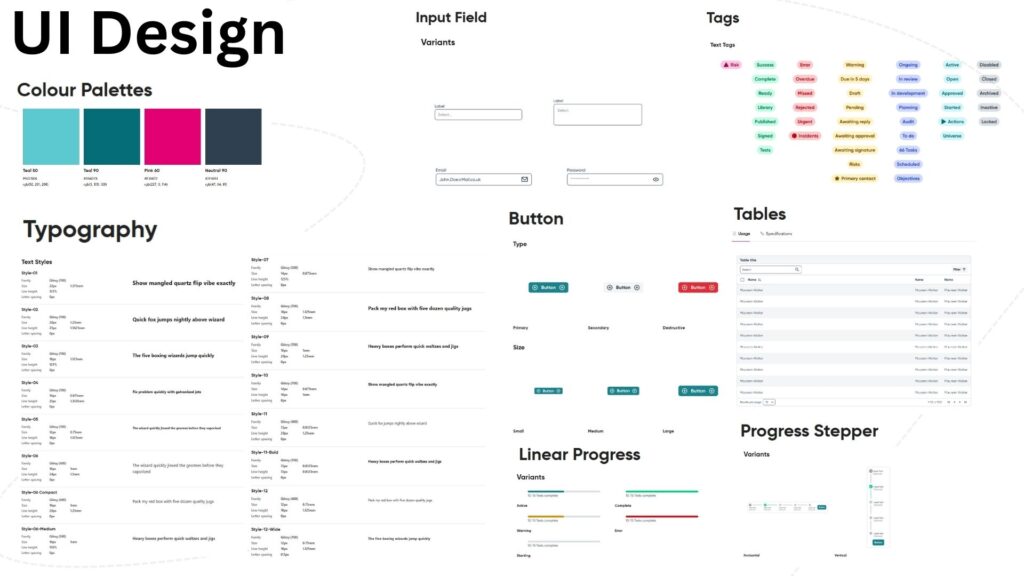
UI components for project
Iteration 1
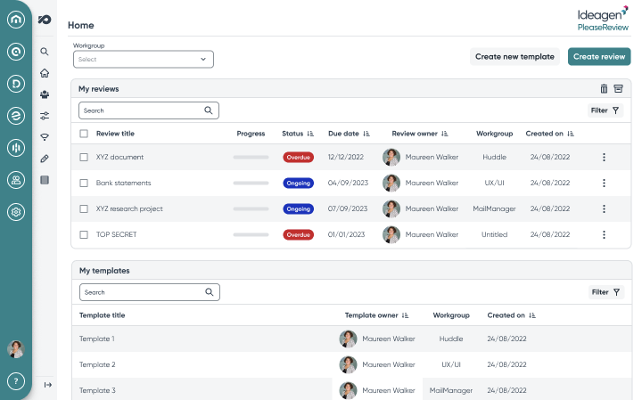
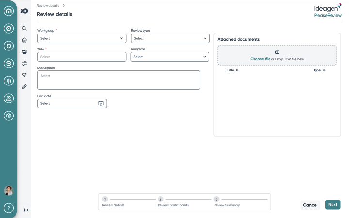
Usability testing
Study type: moderated usability study
Location: London, UK, remote (each participant went through the usability study in their own home or office)
Participants: 6 participants, each completing the study individually. Various different job roles including medical writer, compliance regulator, systems administrator etc.
Length: Each session was 1 hour long, based on a list of prompts
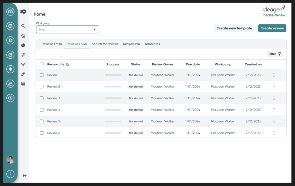
Results: Users navigated the prompts with ease. The majority agreed that the flow remained consistent with the previous design, requiring only a brief adjustment to the updated UI, which they found appealing and well-received. However, users preferred one table with different tabs to navigate with naming conventions like the legacy product; ‘reviews I own’, ‘reviews I’m in’ and templates.
Many appreciated the addition of the information bar, which clearly outlined the capabilities of each role. Some users suggested creating a user manual or guide to share with broader teams, ensuring seamless adoption for anyone needing additional support.
Final design
Changes were made to the final main inbox design after usability testing to reflect what the users asked for. Users have the same tabs available to them incorporated into the new, modern design and with future iterations, I believe we can make this design even more better for users.
Conclusion
Revitalizing this legacy product was both a challenging and deeply rewarding experience. Leading the project from start to finish allowed me to step into a leadership role, driving design meetings with senior leadership and stakeholders while taking full ownership of the design process. This not only honed my skills in collaboration and decision-making but also provided invaluable learning opportunities.
User insights were pivotal throughout this journey. By understanding how users rely on the product in their daily workflows, I gained a profound appreciation for their needs and challenges. This added an emotional dimension to the work, motivating me to ensure the redesign truly simplified their jobs and enhanced their experience.
Ultimately, this project was about more than just modernizing a product—it was about creating a design that respected the users’ familiarity while empowering them with an improved, accessible, and intuitive interface. The lessons I’ve learned, both professionally and personally, will continue to inform my approach to user-centered design in future projects.
What I learned
I learned how mammoth of a task a project such as this can be, how many details there are to consider and how valuable it is to talk to user’s from the beginning as they provide valuable perspective to not only the product it self but how they utilise it which invites creativity and problem-solving.
I also gained a new perspective, of how I want to improve this product not just aesthetically but because how many people use it to do their job, how important it is for them to have a positive experience which really helped me empathise with the users and their frustrations and allowed me to advocate for them better in meetings.
