
LGBTIQ+ Info Case Study
In this final project for the UX Design course by Google, I created a website and app for a LGBTQI+ non-profit organisation
Challenge: Design a website for a LGBTQI+ community who are at high risk of mental health problems, lack the
information & resources needed to help them as well as lack access to community members they could relate with
Solution: My goal was to design an website where LGBTQI+ members can gain access to personal stories, content,
information and education, seminars as well as therapy
Research
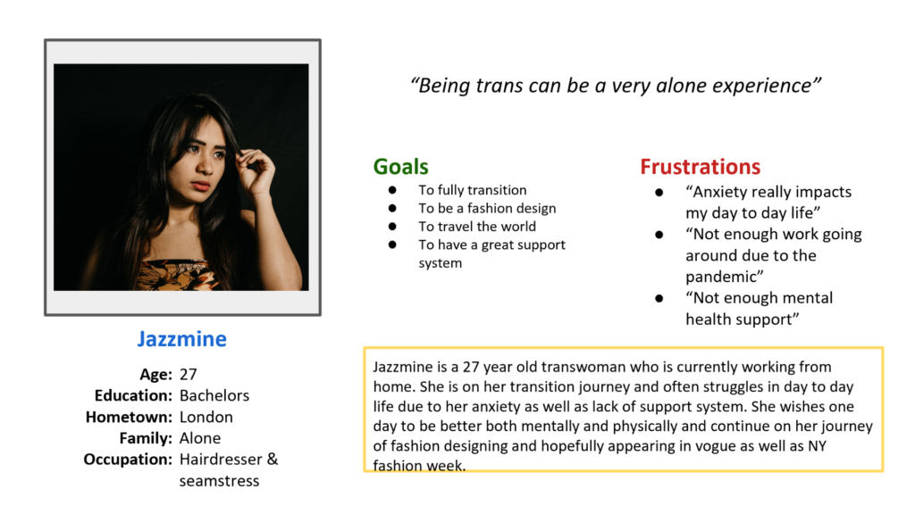
Persona 1.
Persona 2.
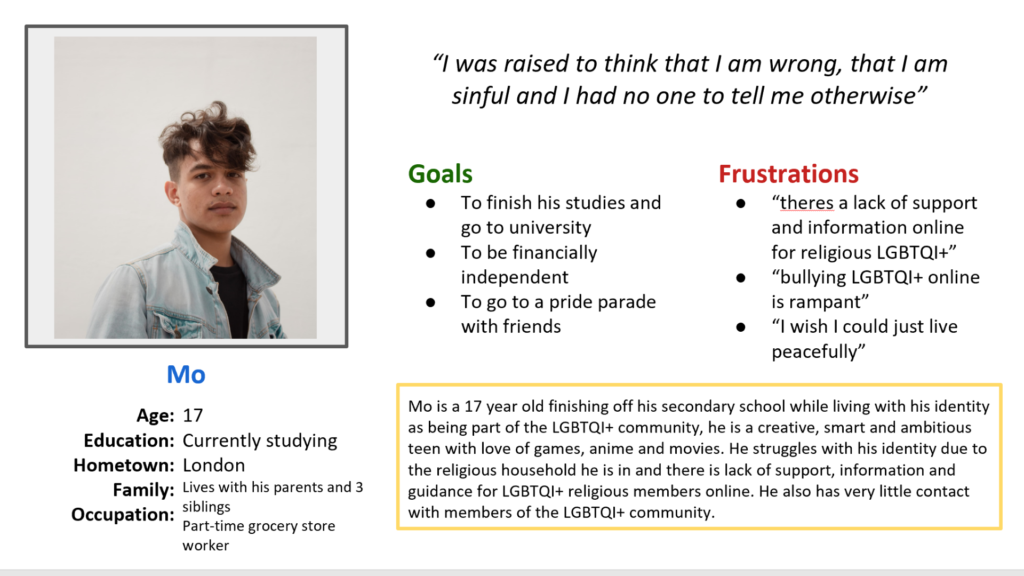
Research Overiew
I conducted user research and received feedback from users that I turned into user personas. One of our user personas, Mo, is a 17-year old currently studying in London. He doesn’t know many LGBTQI+ people as well as struggles with his identity due to his religious upbringing. Research revealed that Mo is also struggling to find any support, information and guidance that will help him with his LGBTQI+ identity.
Important Pain Points Discovered from Research
- Users wanted access to supportive and inclusive community of LGBTQI+
- Users also want access or the ability to gain some therapy to help them with their identity
- Users also want all important, relevant and helpful information, guidance and tools in one place
Ideation
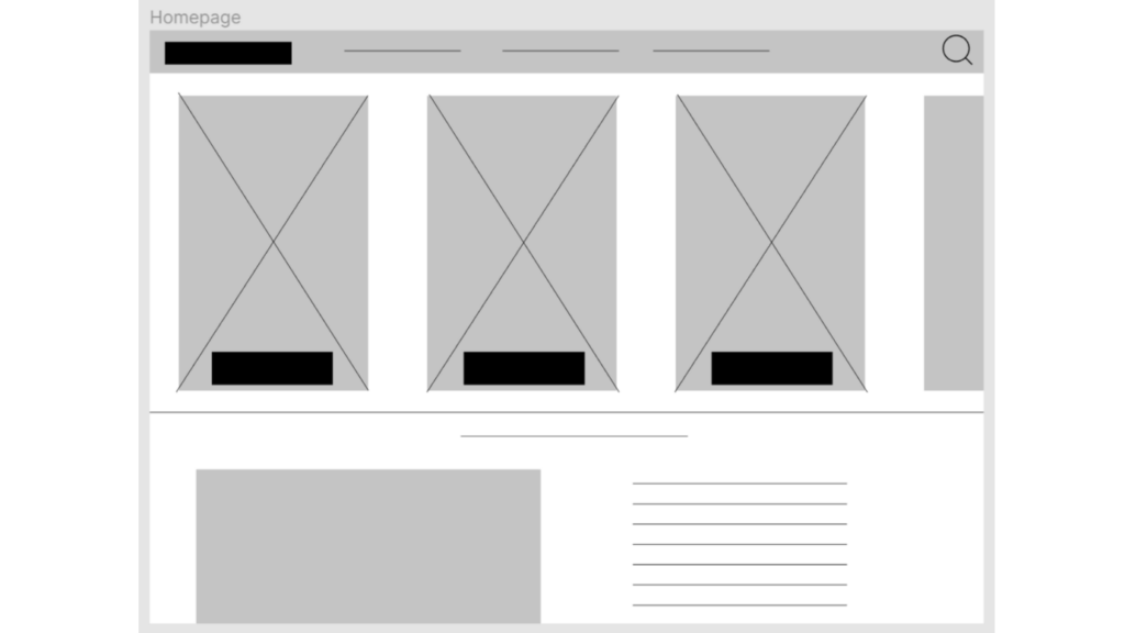
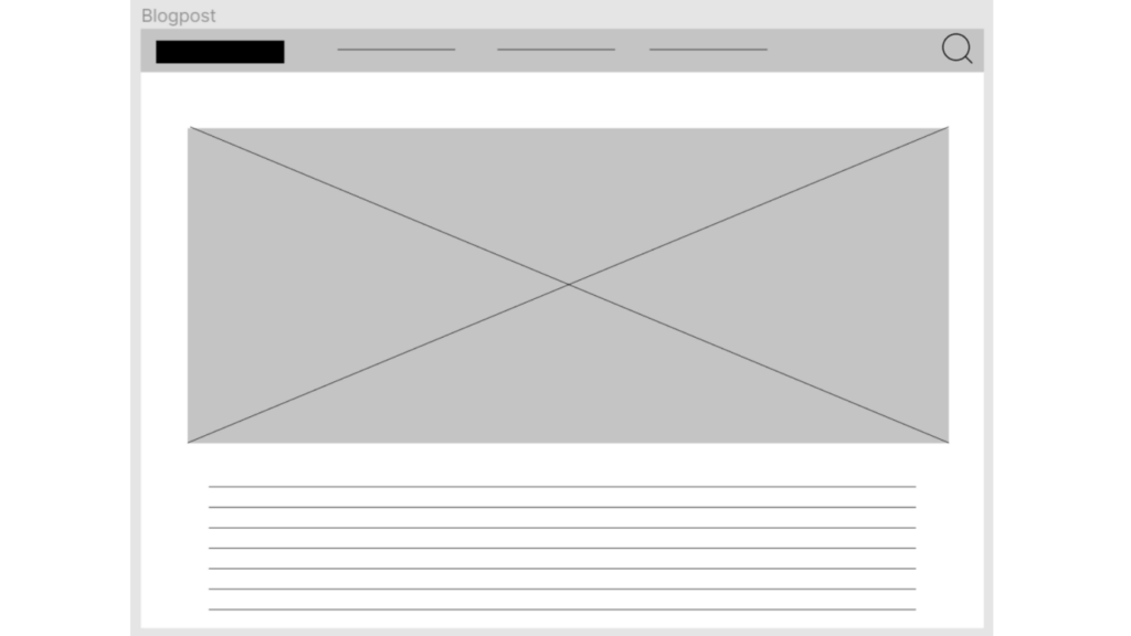
Wireframes
Usability Study
Study type: Unmoderated usability study
Location: London, UK, remote (each participant went through the usability study in their own home)
Participants: Four participants, each completing the study individually. 1 non-binary, 1 female, 1 male and 1 transwoman & the age-range was between 16-29.
Length: Each session was 5-10 minutes, based on a list of prompts
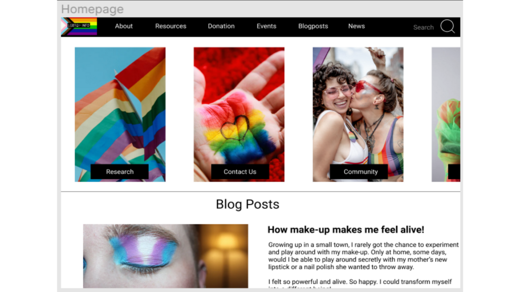
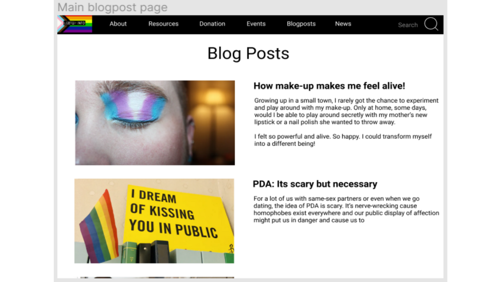
Results: Users wanted the branding and website to be inclusive, accessible and informative. Users also wanted the information to be easy to find. Users did not want a function that requires them to sign up or sign in to access the website. They also wanted to access important article, personal stories in the home-page.
Revised hi-fi prototypes after usability testing
Accessibility considerations
For LGBTQI+ info, the images on each page use alt text to allow a screen reader to read the content. The colour contrast also takes into account people who might have visibility issues.
What I learned
While designing this website, I learned a lot about inclusivity and accessibility and the role it plays for people beyond that of just creating a website or app. Use of positive imagery and messaging can also play a huge role in their well-being and sense of self. This is something I will carry on with me in my career. Additionally, the need for informative, educative and helpful websites and resources are essential and vital to marganlised communities so that is something I would like to further on more for other non-profits.
As time goes on and users continue to give feedback as well as you look at the website design more, future improvements will surface and become clearer, and the product will continue to get better.
Moving forward, I would like to conduct another round of usability testing to validate whether the pain points my users experienced have been fully resolved. This would validate that all the updates as well as introduce me to any new pain points that might have occurred.