
Insights dashboard
My role: Lead UX designer and researcher
Challenge: Users lacked visibility into the real-time status of ongoing document reviews in PleaseReview. There was no centralized way to track reviewer engagement, comment categories, or individual progress — making it difficult for project leads to identify blockers, assess feedback quality, or ensure timely completion of reviews.
Solution: I designed an Insights Dashboard that gives users a clear overview of key review metrics — including who has commented, the categories of their feedback (e.g., content, legal, formatting), and each reviewer’s progress. This dashboard empowers teams to monitor activity in real time, identify gaps or bottlenecks, and drive more efficient and collaborative review cycles.
Business value: By introducing this new feature, we increased user satisfaction through increased user visibility which allowed them to plan and work efficiently, increased alignment across teams which was a major pain point and overall decreased churn.
Research
To better understand user needs around insights dashboard, I conducted user interviews with active PleaseReview users, including project leads and review owners. The goal was to understand what kind of information would they like to see on the dashboard and why
Key findings included:
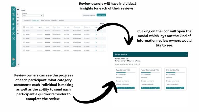
Progress visibility: Users consistently expressed frustration at not being able to easily track the overall progress of a review or see which participants were lagging behind. They wanted a clear, at-a-glance view of who had completed their review and who hadn’t.
Participant-specific insights: Users wanted to know how engaged each reviewer was — specifically, how many comments each person had left and how active they were during the process.
Comment categorization: Users also emphasized the importance of understanding the type of feedback being provided. They requested clear indicators for comment categories such as “major”, “minor”, or “suggestion” to help prioritize revisions and streamline review meetings.
These insights directly informed the features and structure of the Insights Dashboard, ensuring it addressed the real pain points users experienced during collaborative reviews.
Ideation (High fidelity designs)
Next steps
Its important that my design is validated by users and I get the opportunity to iterate and make changes depending on user feedback so the next step would be to book in prototype testing sessions with users and get this design in front of them.
What I learned
This was my first time working on an AI concept design. This allowed me the opportunity to learn more about the capabilities and limitations of machine learning from a technical perspective and how that would inform my designs.
First thing I learned was the importance to present clear, structured data visualising important information that users want to see. From that perspective, it was straight-forward when it came to designing the dashboard. I wanted to showcase information users wanted to see in a very seamless and accessible way while also leaving room for future iterations and improvements.